EF Education First
Role
Senior UX/UI Designer
Team
Creative Director, Product Owner, UX Researcher, Developers
Deliverables
Product vision and roadmap definition, UX research and information architecture, design system creation, developer handoff and implementation oversight, prioritisation and delivery planning.
Year
2018 – 2020
Insight
One brand, 114 countries. Designing for a world of different cultures, languages, and perspectives.
EF Education First is one of the world’s largest international education companies, offering language learning, cultural exchange, and academic programs across 114 countries. As Art Director, my role was to redesign their global site — improving both the user experience and the overall visual identity.
The core challenge was scale. Designing for a truly global audience meant accounting for everything: different languages and reading directions, cultural associations with colour, varying imagery expectations, and the nuances of how people across the world engage with digital products. Every decision had to feel considered and consistent, whether the site was viewed in Tokyo, São Paulo, or Stockholm.
01 EF.COM: designed for the world
Designed for the world
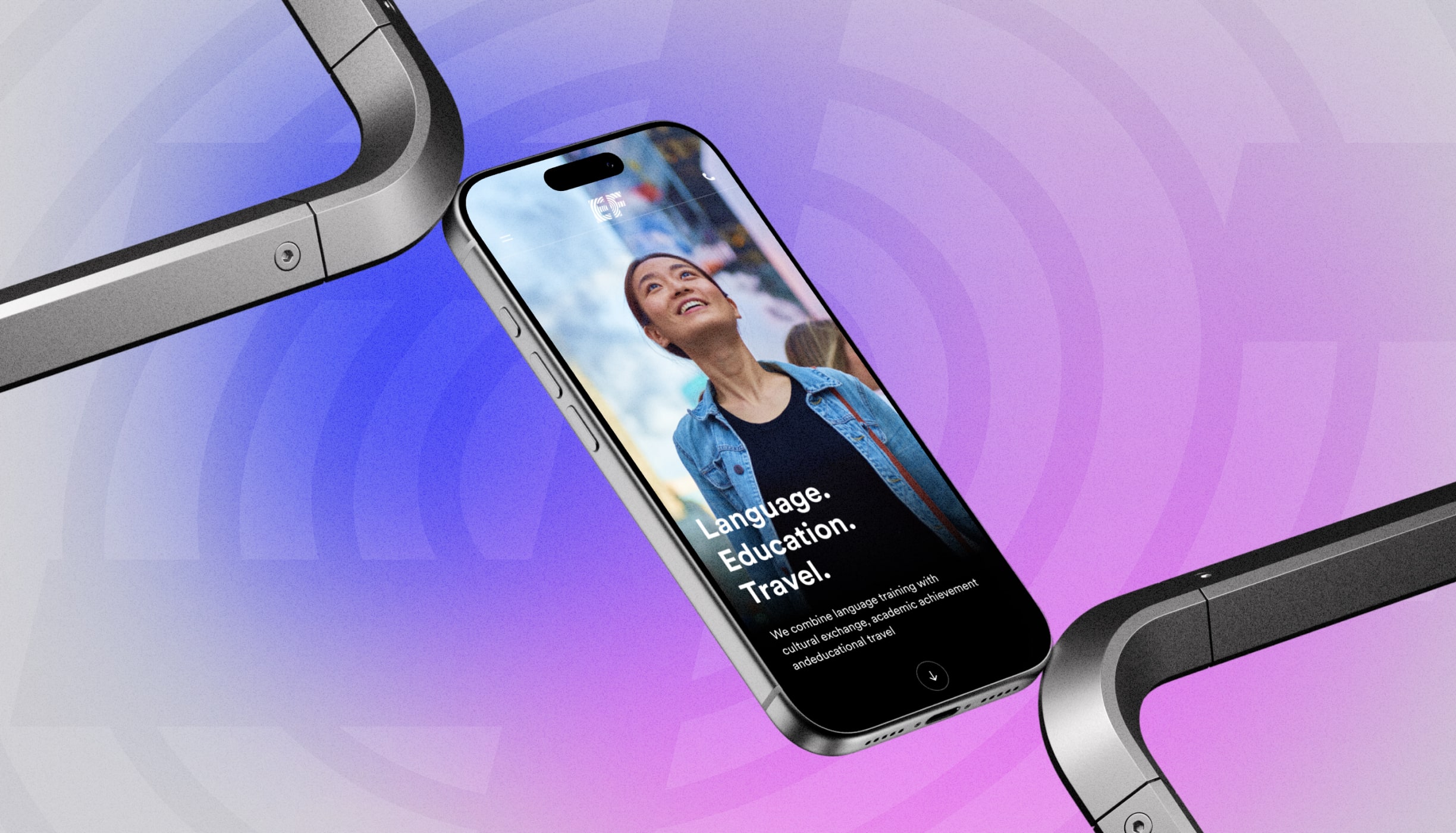
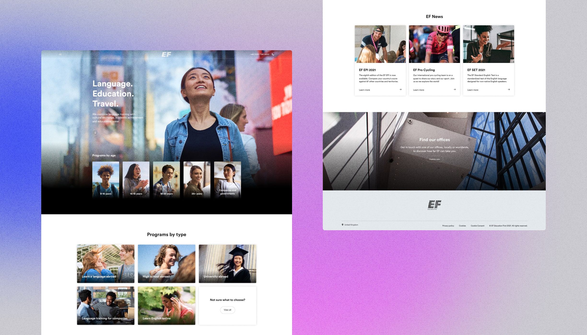
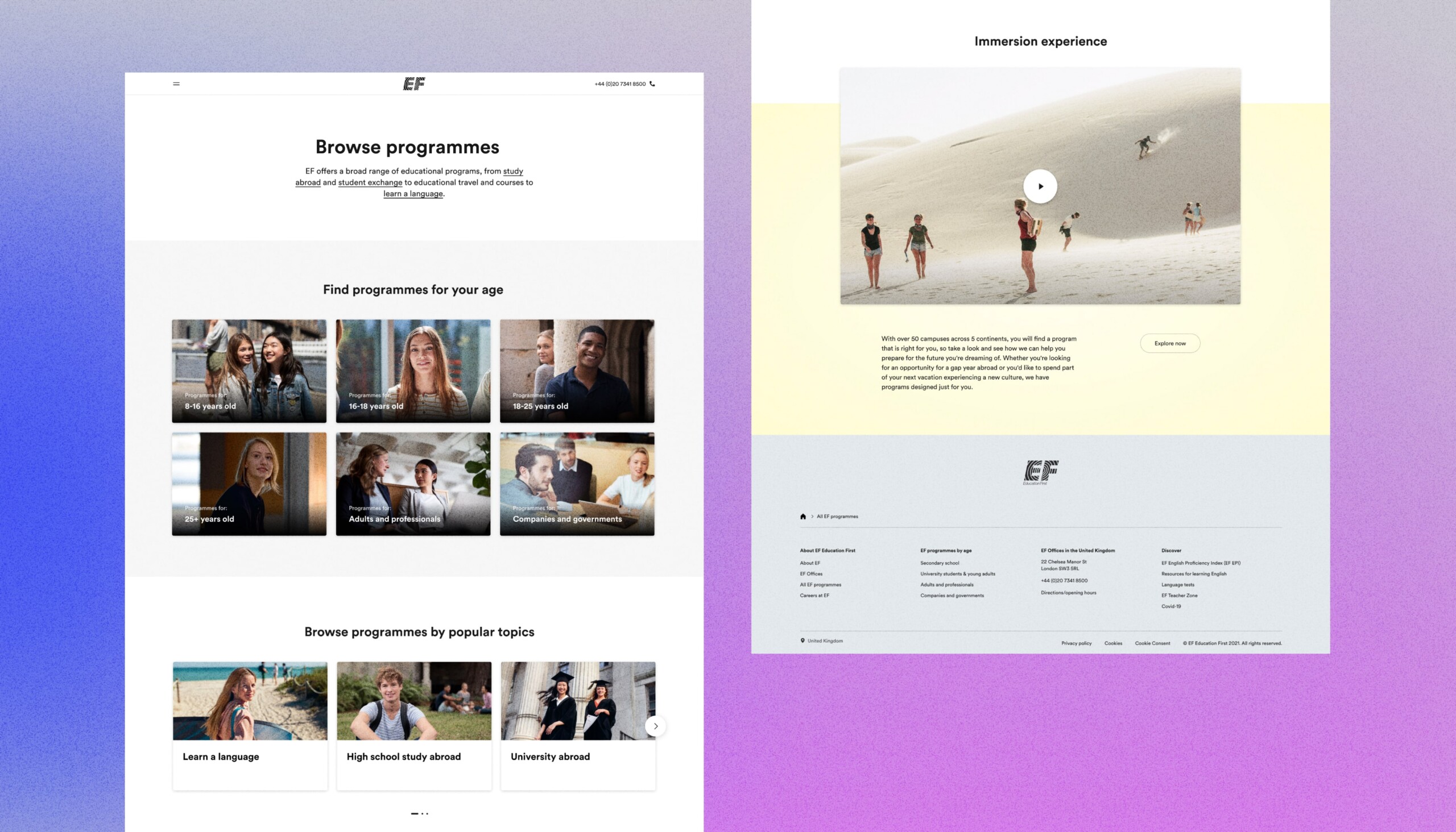
The EF homepage was designed to communicate the full breadth of EF’s offering through a single, confident first impression. The hero section leads with a full-bleed lifestyle photograph, overlaid with bold typographic headlines that anchor the composition and create immediate visual impact.
Below the fold, the layout opens into a clean white canvas where programme cards are organised by age group and category, making a complex catalogue instantly navigable. A consistent, image-led grid system brings clarity and structure, while each card balances photography, concise labelling, and generous spacing.
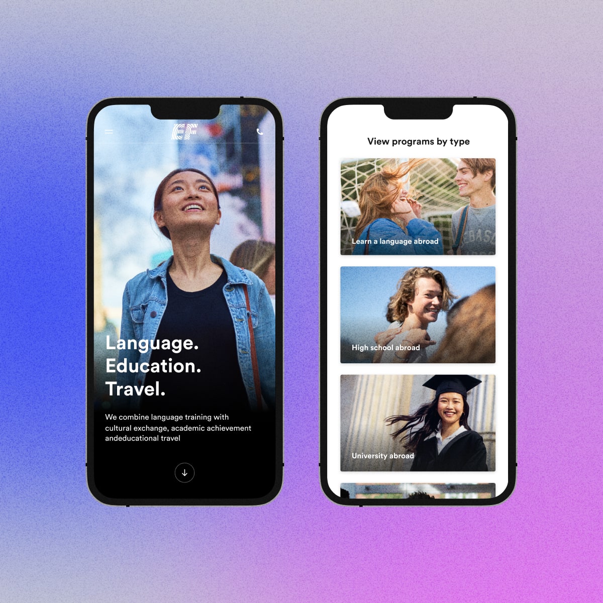
Full experience, smaller screen
The mobile homepage distils the desktop experience into a single, scrollable column without losing its visual impact. As users scroll, programme cards stack vertically in a full-width layout, each led by strong photography and clear, concise labelling.
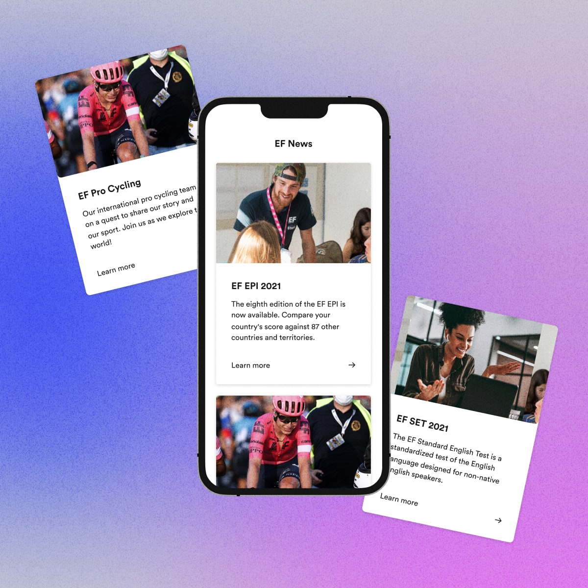
News that travels well
The mobile news card takes an intentionally editorial approach, led by large-format photography, a clear headline, a concise two-line description, and a minimal “Learn more” link. Designed to scale across a wide range of content and languages.
Different languages, same experience


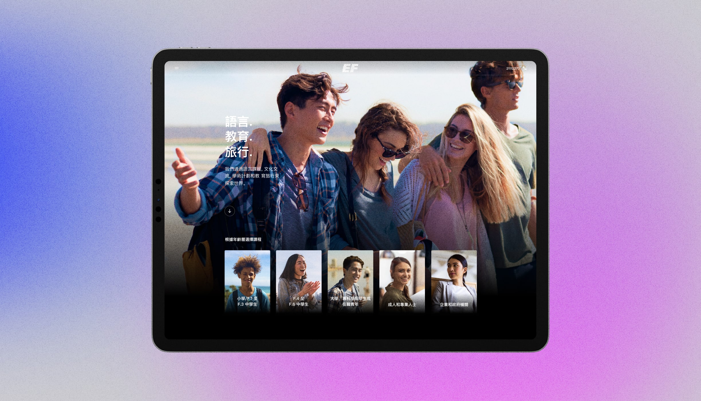
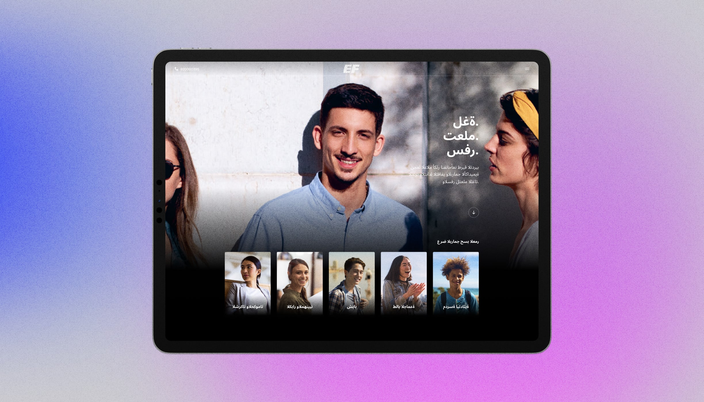
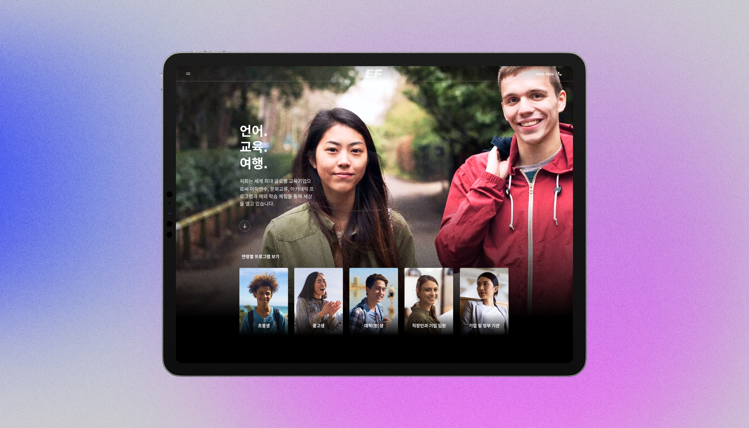
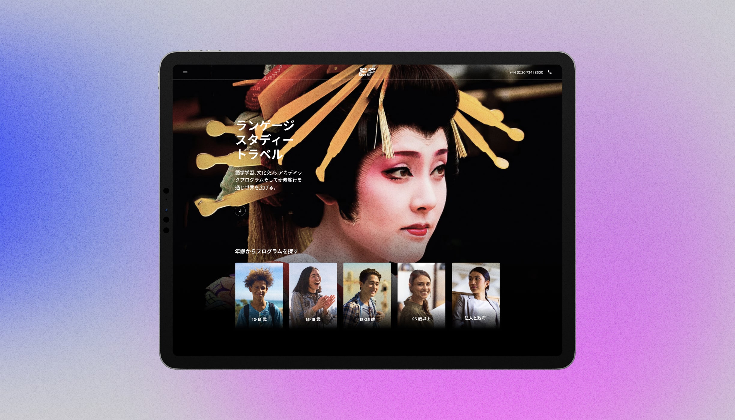
One homepage, every language
Different markets required different expressions of the same product. From Chinese to Arabic to Korean and Japanese, each homepage was tailored to resonate with its local audience. Photography, typography, and art direction were carefully adapted for every market, while the underlying design system ensured the experience remained unmistakably EF across every language and reading direction.
02 EF Program Guide
Improving clarity across the EF catalogue
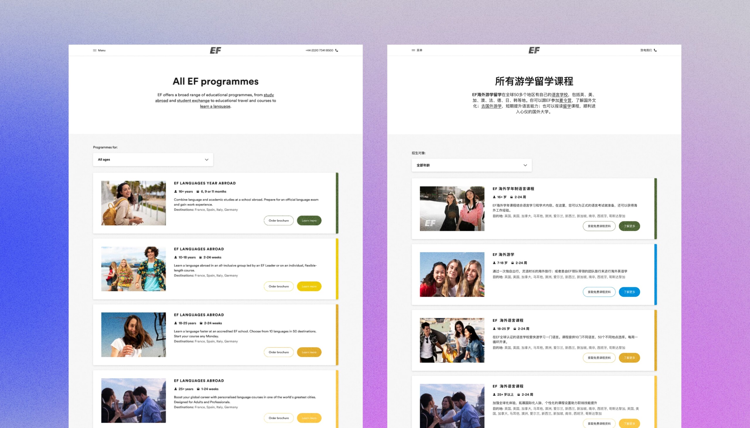
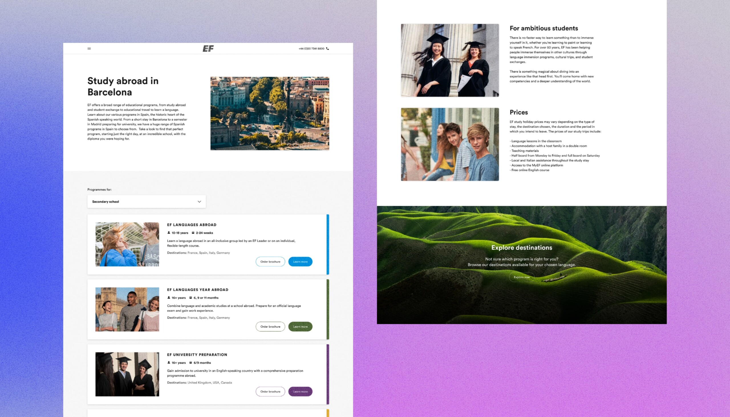
The EF Program Guide is one of the most important pages in the platform — a central hub where users explore courses, compare options, and find the programme that best fits their needs. The redesign focused on improving clarity, navigation, and overall usability through a more structured layout, stronger visual hierarchy, brighter imagery, and a completely reworked card system designed to make complex choices feel simple and intuitive.
One design, multiple languages
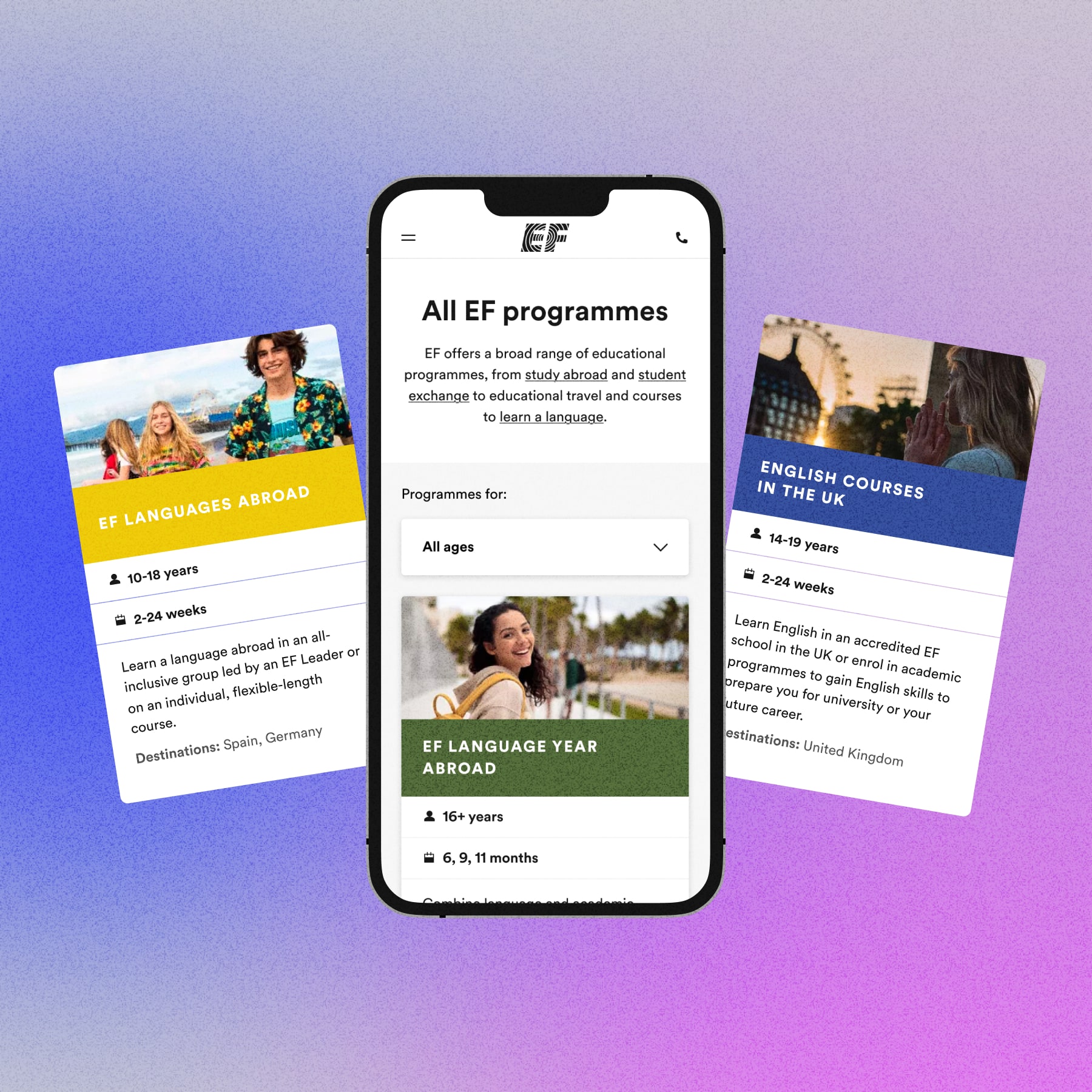
Each program guide card was redesigned from the ground up to work seamlessly across every language and market. It surfaces all the essential information users need to make a decision: programme name, age range, duration, destinations, a short description, and two clear CTAs, while remaining robust across varying text lengths and scripts. Colour-coded left borders support quick visual wayfinding across programme types, and icons alongside imagery further improve scannability and recognition.
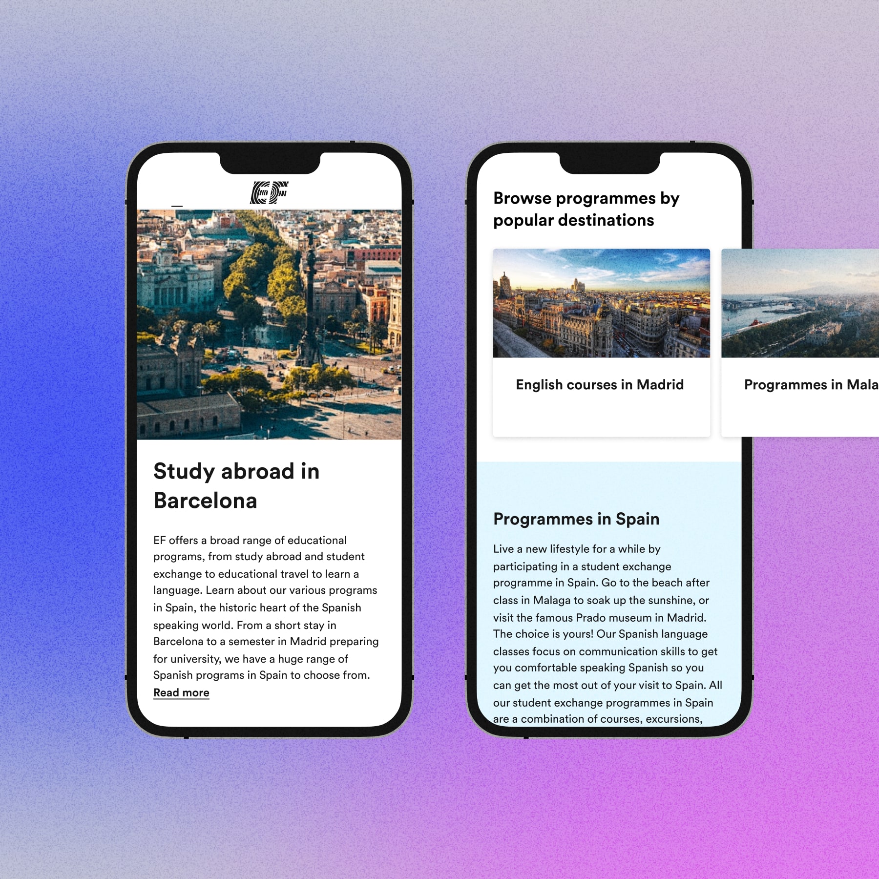
English market
The mobile version of the programme listing brings the card system into sharp focus. Freed from the desktop grid, each card occupies the full screen width — making the title, photography, duration, and description all clearly readable in a single glance.
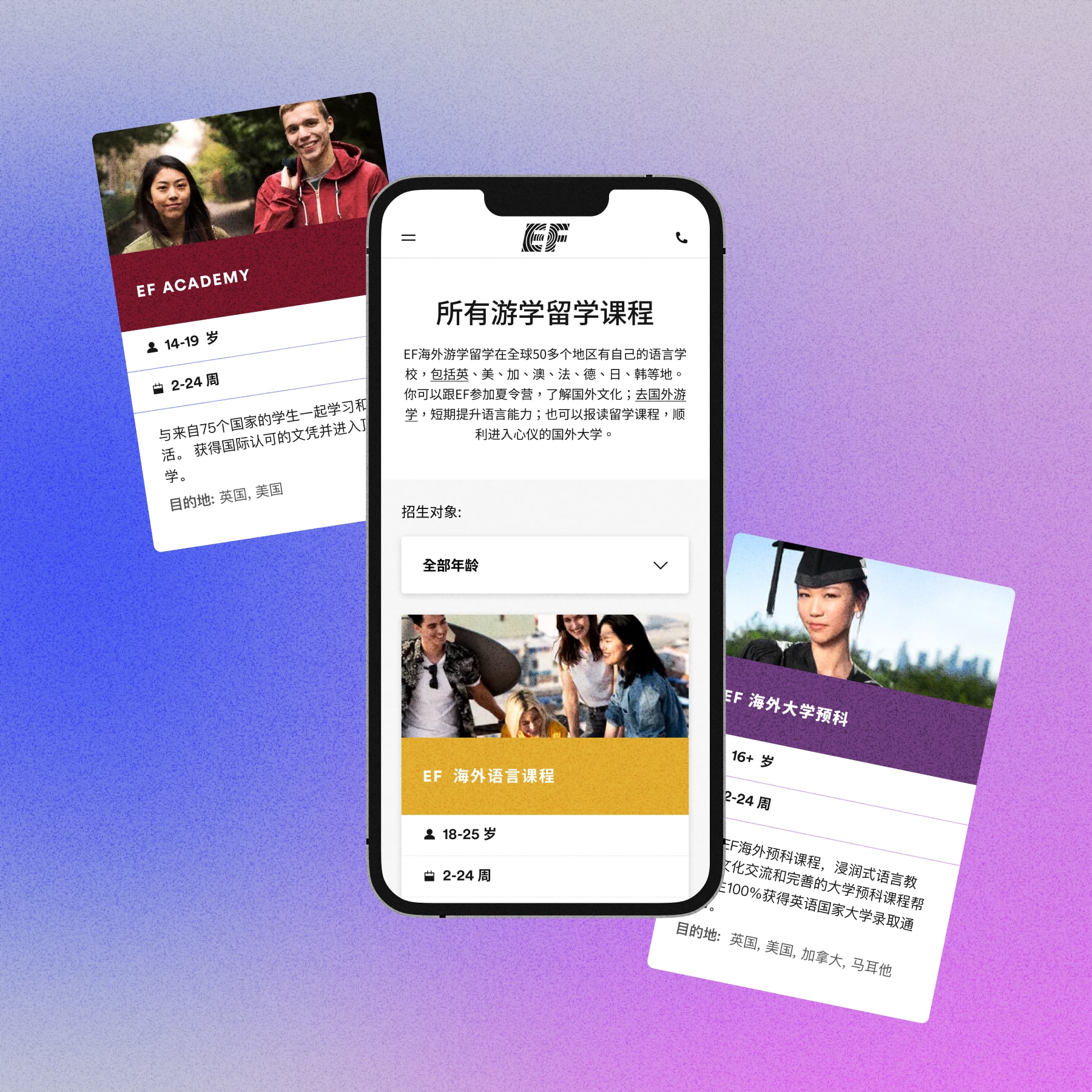
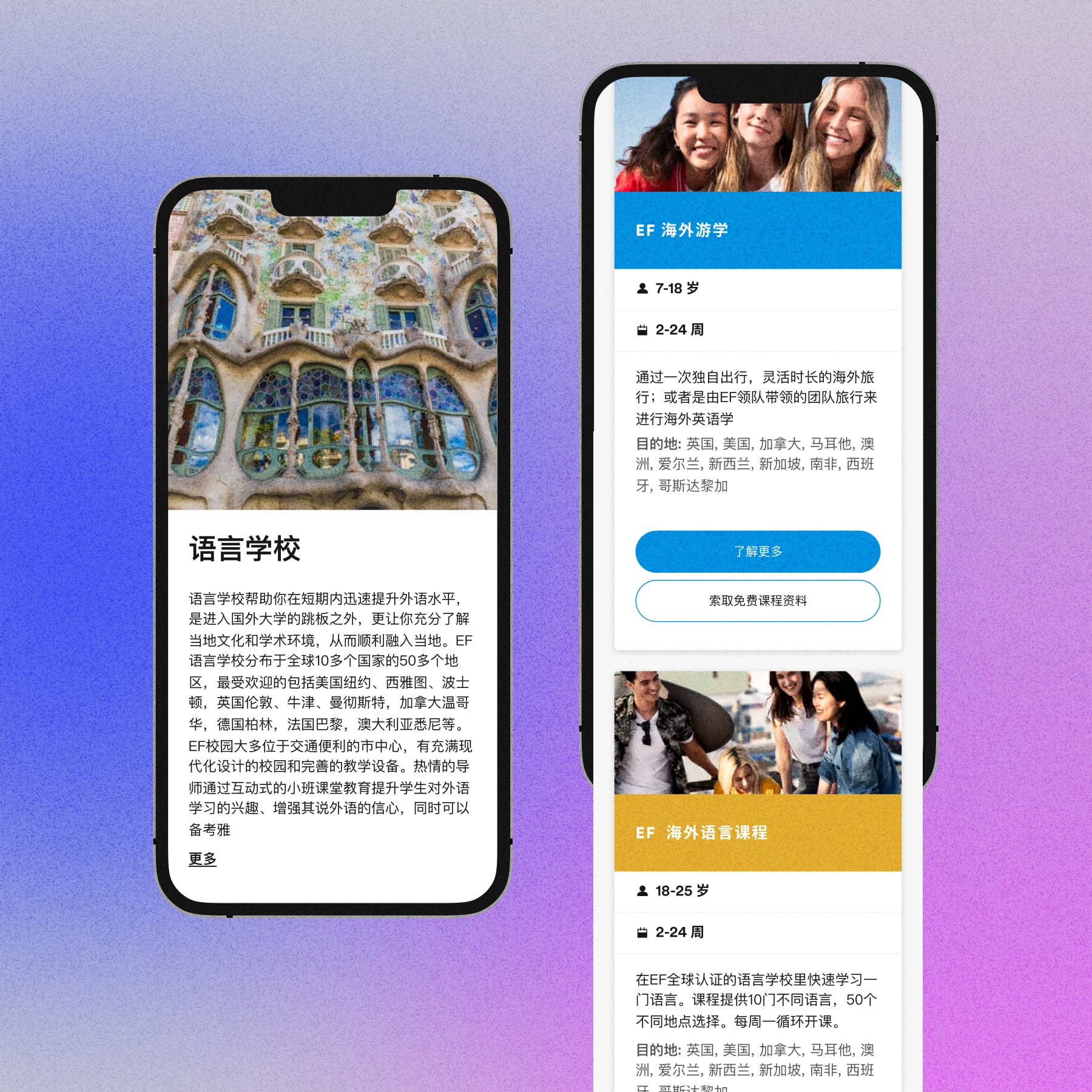
Chinese market
The Chinese version on the right shows how the card holds up under localisation pressure. Even with denser text, a different typographic rhythm, and a completely different script, the structure remains intact, clear and legible.
Built to convert
The programme guide site needed to work hard — helping prospective students navigate a wide catalogue of courses, destinations, and age groups without feeling overwhelming. Each page adapts to its market, surfacing relevant programmes through filters, pairing them with destination imagery and clear pricing information to guide users from interest to decision.
03 Design System
The design system acts as the foundation that holds the entire experience together. It provides a consistent structure of components, spacing, typography, and colour logic that can adapt across languages, markets, and content types without breaking hierarchy or clarity. By combining flexibility with clear rules, the system ensures every page and component feels cohesive and recognisably EF, while still allowing for local adaptation where needed.
Results
- Redesigned EF’s global site across 114 countries, improving consistency, user experience, and visual identity at scale
- Built a bespoke design system, tailored specifically for global and localised markets
- Delivered designs across multiple sites including the global homepage, programme guide, contact page, and about us site
- Ensured every design decision accounted for cultural differences in colour, language, imagery, and user behaviour across key markets including Europe, USA, and China